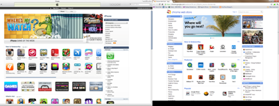
Why does the Chrome Web Store look so much like the Apple App Store? I am not just referring about the overall look. The placements and naming of the various categories are really similar as well.
For example the Ad on the top, the "New & Noteworthly" below it, the "What's Hot" aka "Popular" at the bottom, the "Top Charts Paid Apps" aka "Favourite Paid Apps" at the right panel.
This is a fantastic layout! Blackberry should really learn a thing or two from this...
For example the Ad on the top, the "New & Noteworthly" below it, the "What's Hot" aka "Popular" at the bottom, the "Top Charts Paid Apps" aka "Favourite Paid Apps" at the right panel.
This is a fantastic layout! Blackberry should really learn a thing or two from this...

Comments